01
Campaign Design
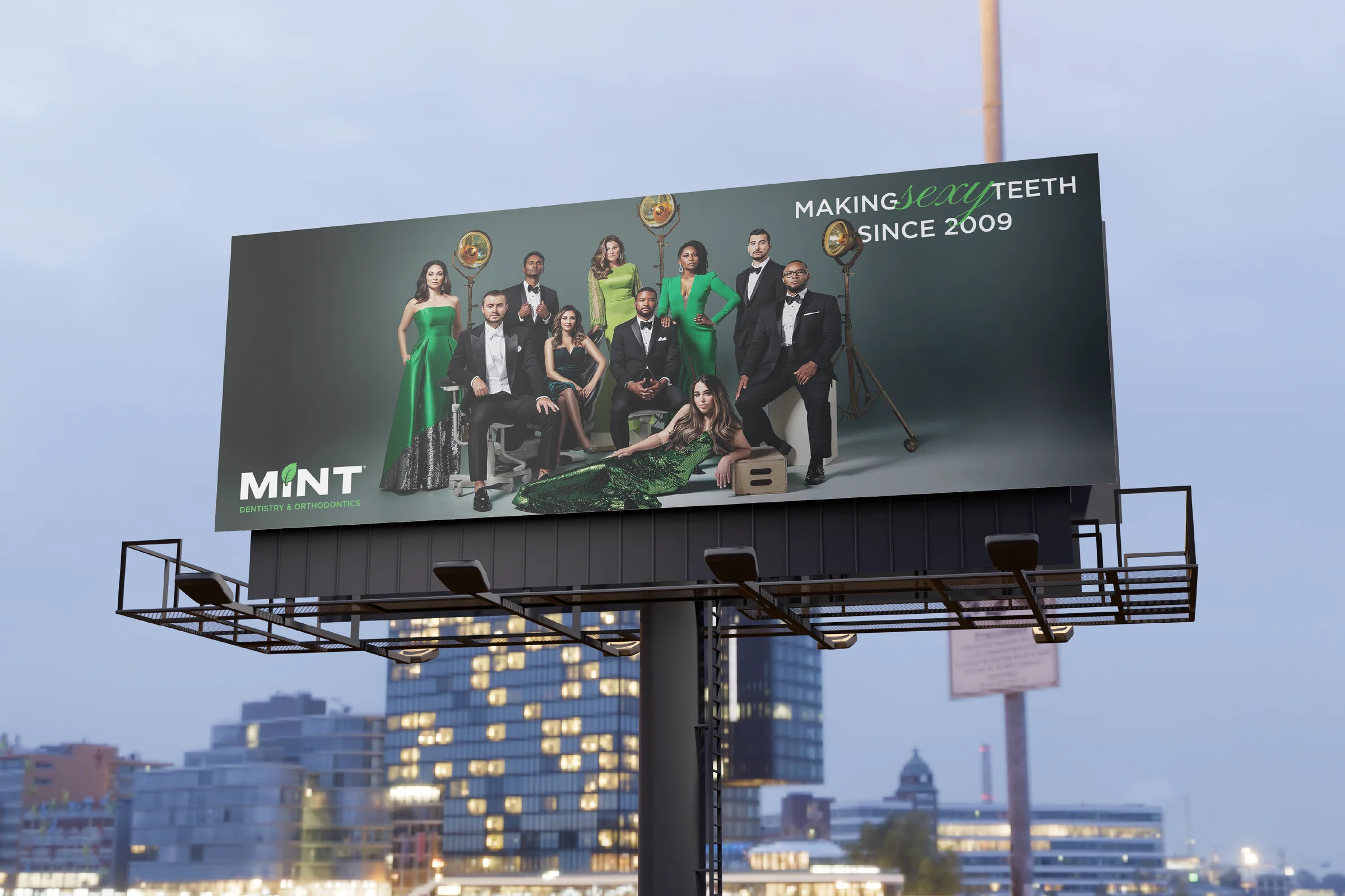
Board-by-board layout system for the out-of-home run, sized and proofed for highway legibility.

Billboards, brochures, building art and neon for the brand that made dentistry glamorous — including the “sexy teeth” boards you have definitely driven past.


“Love your dentist.” “Get in MINT condition.” “We make sexy teeth.” MINT built a dental empire on swagger, and the large-format work had to keep that promise at highway scale.
Deuxmont art-directed the campaign layer of that brand: the boards, the brochures, the building art, the wall graphics and the neon. Every piece had to win the three seconds a driver gives a billboard — legible at distance, premium up close, and unmistakably MINT from Dallas to Houston.

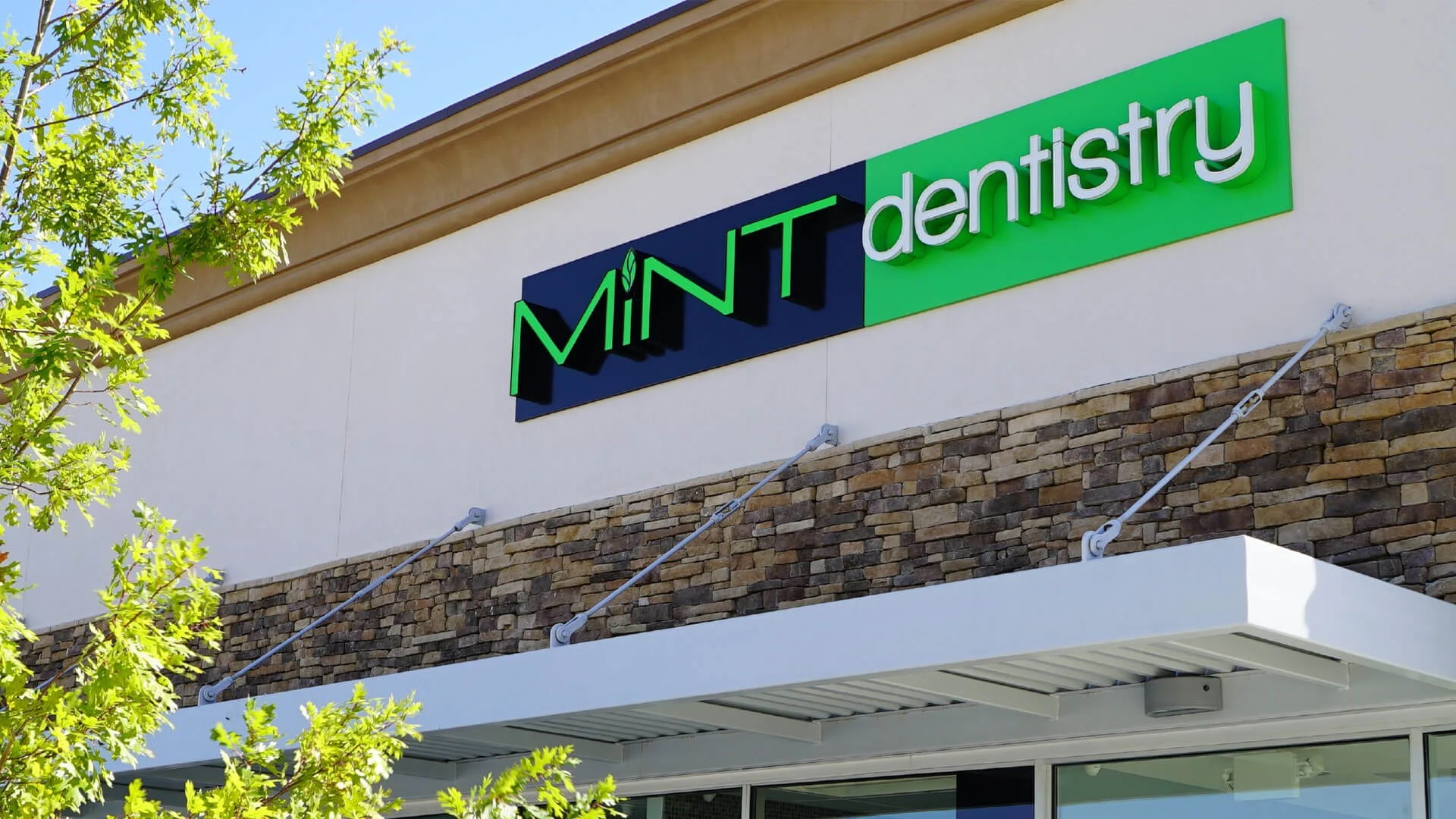
The system is deliberately narrow: angular MiNT capitals with the leaf dotting the lowercase i, one kelly green owned outright, and black-and-white discipline everywhere else. Narrow systems travel. They survive being printed by five vendors in three cities.
The leaf carries the brand alone when there is no room for a wordmark — on a door pull, a mirror decal, an app tile, a wall three storeys tall. The wordmark carries it when there is. Nothing else is allowed to compete for attention.
Angular capitals with the leaf as the dot — the lead signature on boards, storefronts and campaign layouts.
Built to stand alone at any scale, from a neon line in a lounge to a supergraphic on a building wall.

The same capitals extended to MINT orthodontics without diluting the parent brand's recognition.
#000000#FFFFFF#3CBD3C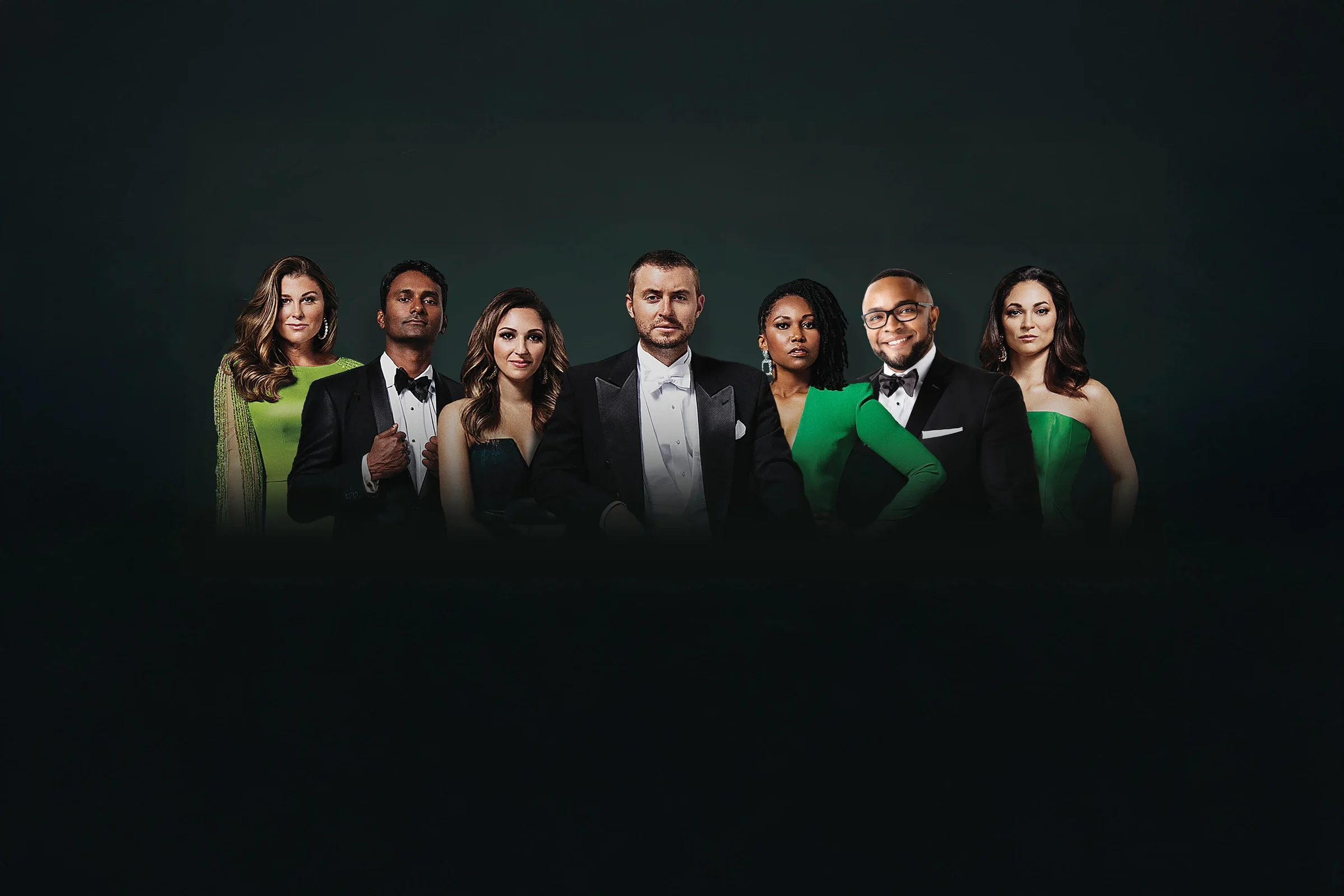




The campaign never lived in a deck. It lived on a highway, on a storefront, on a wall in a waiting room where somebody is quietly nervous about a cleaning.
So every layout was proofed the way it would actually be seen: from a moving car, at night, at an angle, half-blocked by a truck. Copy got shorter. The green got louder. The leaf got bigger.
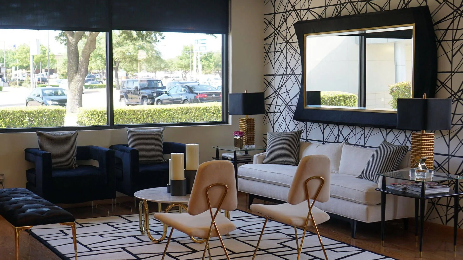
Up close the register flips — the same system has to feel like a luxe spa, not a clinic. Neon, warm lighting and restrained type do that work in the lounges and the treatment rooms.


Board-by-board layout system for the out-of-home run, sized and proofed for highway legibility.
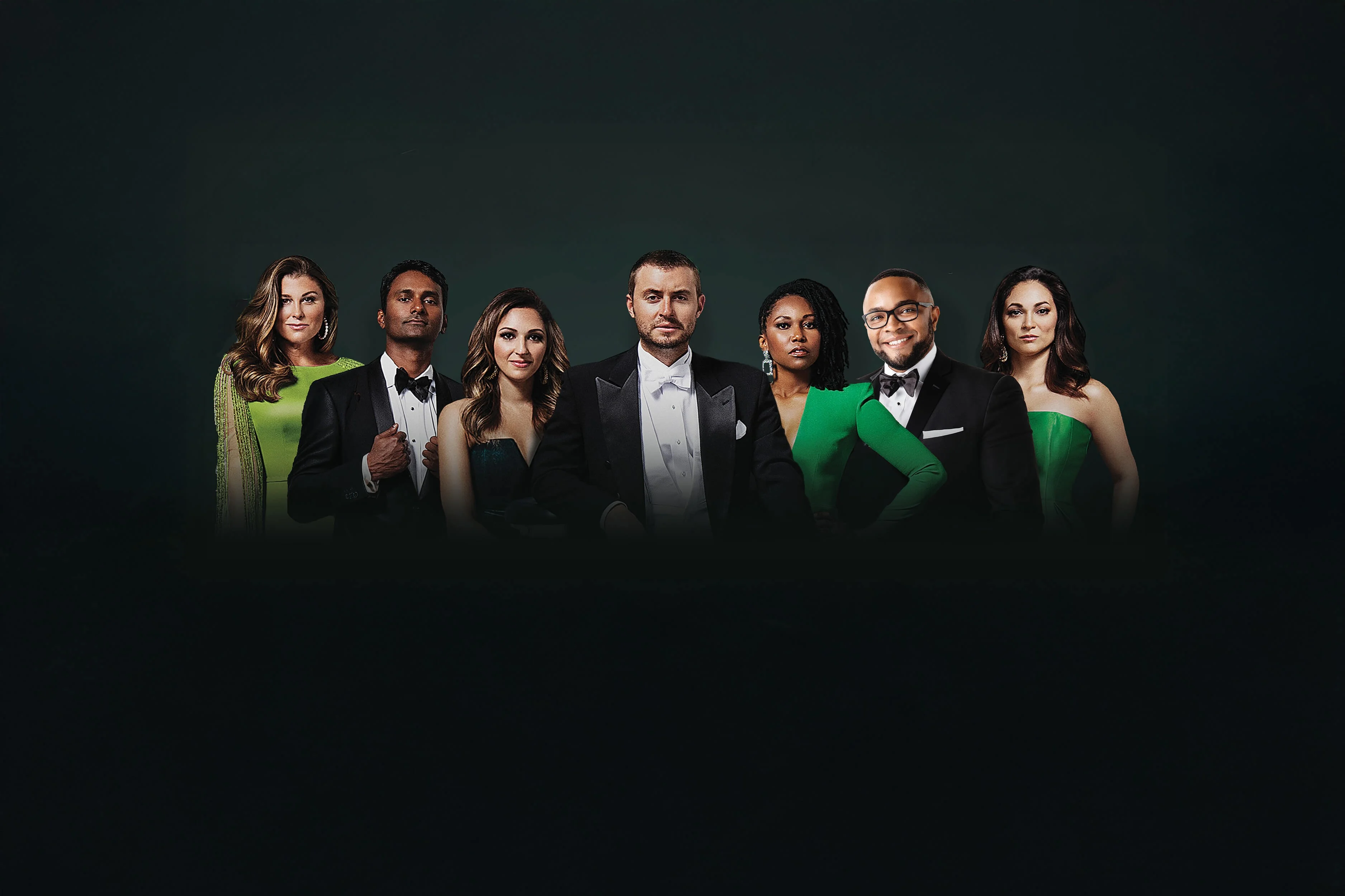
Photographers briefed on the exact smile — joy, not stock. Casting, styling and color held to one standard.
Brochures and patient collateral built on the same grid, with printers held to tighter color tolerances than they liked.
Leaf supergraphics and exterior treatments scaled for architecture without losing the mark's proportions.
Interior neon lines and signage that make the clever copy earn its place in the room.
“You don't read it. You recognize it — that's the whole point of large format.”Deuxmont · Art Direction
If your category looks like wallpaper, that is an opportunity. Let's build the version people recognize at a glance.
Start a Project